
Component Guide
This guide contains information on all component that you are able to add to pages
- Block: Chatbot
- Block: CTA
- Block: Downloads
- Block: Image Text (full width)
- Block: Overview
- Block: Quote
- Block: Share
- Block: Table
- Block: Text Image (2 cols)
- Block: Block Text Image Crop
- Block: Unibuddy - Landing Page
- Block: Unibuddy - Slider
- Block: Video Text
- Block: Wysiwyg
- Form: Leads
- Grid: Contacts
- Grid: Content
- Grid: Logos
- Grid: Quotes
- Grid: Teasers
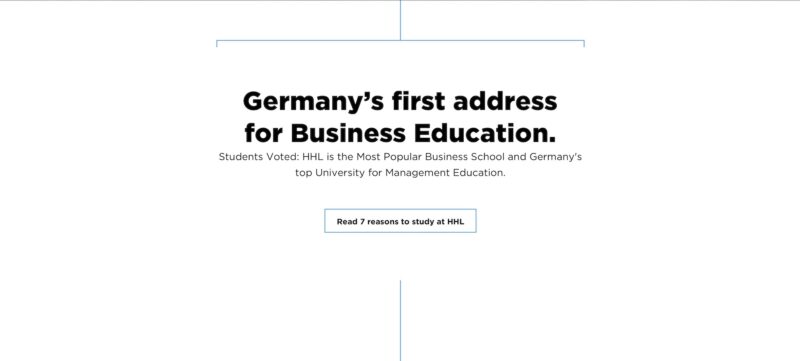
- Hero: BlockArrowCTA
- Hero: HeaderMedia
- Hero: ImageText
- Hero: MediaSlider
- Hero: TeaserCta
- List: Components
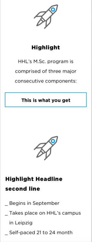
- List: Facts
- List: Quote
- Navigation: Sub
- Reusable
- Slider: Gallery
- Form: Contact
Block: Chatbot
Block: CTA

Fields
- Title Content (Wysiwyg) Recommended characters: 40-60
- Nav Links (Repeater) Tab style navigation buttons. (optional)
- Link (Link)
- Main Content (Wysiwyg) Recommended characters: 100-200
- CTAs (Repeater)
- CTA (Link)
- Button Style (Select)Options:
- Primary
- Secondary
- Component Title (Text) Title shown in navigation and in the backend, doesn't show on the frontend (other than in the Sub Navigation)
- Component Anchor (Text) Use this anchor to link directly to this section. E.g. enter
'gallery'to be able to link tohttps://ihredomain.com/page#gallery. Do NOT enter the '#' symbol. - Hide Component (True_false) Hide the component, when this option is active
- Decoration Top (Select) The decoration shown at the top of the component, 'border' will show the containing bracket. 'line' just the vertical lineOptions:
- None
- Line
- Border
- Decoration Bottom (Select) The decoration shown at the bottom of the component, 'border' will show the containing bracket. 'line' just the vertical lineOptions:
- None
- Line
- Border
Block: Downloads

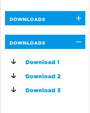
Fields
- Title (Text) Recommended Characters: 30-60.
- Content (Wysiwyg) Content that sits above the links and downloads (optional).
- Show table ? (True_false)
- Table (Post_object) Please select a table from the dropdown. Tables are created in the JTRT Tables plugin.
- Table Background Color (Select) Select a background color for the first table columnOptions:
- Orange
- Blue
- Hide Table Header (True_false)
- Thin forms? (True_false) Show a thin form for forms with more data.
- Downloads (Repeater)
- Type (Button_group)Options:
- File
- Link
- Title (Text) Text that is shown as the link. Recommended Characters: 10-80
- Link (Url)
- Download (File) Selectable file upload, most standard file formats supported.
- Type (Button_group)
- Component Title (Text) Title shown in navigation and in the backend, doesn't show on the frontend (other than in the Sub Navigation)
- Component Anchor (Text) Use this anchor to link directly to this section. E.g. enter
'gallery'to be able to link tohttps://ihredomain.com/page#gallery. Do NOT enter the '#' symbol. - Hide Component (True_false) Hide the component, when this option is active
- Show Line Decoration (Button_group) Show/hide the connecting line at the bottom/top/both of the component.Options:
- None
- Top
- Bottom
- Both
Block: Image Text (full width)


Fields
- Pre Content (Wysiwyg) Free WYSIWYG area. No content restrictions.
- Desktop Image (Image) Recommended resolution greater than 1200 x 675 px.
- Mobile Image (Image_crop) Recommended resolution greater than 390 x 570 px.
- Content (Wysiwyg) Free WYSIWYG area. No content restrictions.
- Component Title (Text) Title shown in navigation and in the backend, doesn't show on the frontend (other than in the Sub Navigation)
- Component Anchor (Text) Use this anchor to link directly to this section. E.g. enter
'gallery'to be able to link tohttps://ihredomain.com/page#gallery. Do NOT enter the '#' symbol. - Hide Component (True_false) Hide the component, when this option is active
- Show Line Decoration (Button_group) Show/hide the connecting line at the bottom/top/both of the component.Options:
- None
- Top
- Bottom
- Both
Block: Overview


Fields
- Header Content (Wysiwyg) Content that sits above the three columns, No content restrictions.
- Intro Content (Wysiwyg) Content that site above the two columns on the left, but to the right of the call to actions column. No content restrictions
- Show Columns (True_false) Shows/hides the two content columns on the left.
- Columns (Group)
- Left Column Content (Flexible_content) Left column content. Add either an icon, or a WYSIWYG area.
- Right Column Content (Flexible_content) Right column content. Add either an icon, or a WYSIWYG area.
- Buttons (Repeater) Repeater field for the buttons on the right of the component.
- Button Link (Link)
- Button Style (Select) Choose either Primary (blue background) or Secondary (blue outline).Options:
- Primary
- Secondary
- Links (Repeater) Repeater field for the links on the right of the component.
- Link (Link)
- Link Arrow Style (Button_group) Choose the direction of the arrow for the linkOptions:
- Component Title (Text) Title shown in navigation and in the backend, doesn't show on the frontend (other than in the Sub Navigation)
- Component Anchor (Text) Use this anchor to link directly to this section. E.g. enter
'gallery'to be able to link tohttps://ihredomain.com/page#gallery. Do NOT enter the '#' symbol. - Hide Component (True_false) Hide the component, when this option is active
- Theme (Select)Options:
- Dark
- Light
- Show Line Decoration (Button_group) Show/hide the connecting line at the bottom/top/both of the component.Options:
- None
- Top
- Bottom
- Both
Block: Quote

Fields
- Quote Title (Text) An optional heading title that sites above the quote block.
- Quote (Wysiwyg) The quote, there are no content restrictions here, but use [readmore][/readmore] to allow for longer quotes.
- Image (Image) Square image for quote, recommended minimum size 320px x 320px
- Name (Text) Name of quote source. Recommended Characters: 20-80
- Job Title (Text) Job Title of quote source. Recommended Characters: 20-120
- Call to Action (Link)
- Component Title (Text) Title shown in navigation and in the backend, doesn't show on the frontend (other than in the Sub Navigation)
- Component Anchor (Text) Use this anchor to link directly to this section. E.g. enter
'gallery'to be able to link tohttps://ihredomain.com/page#gallery. Do NOT enter the '#' symbol. - Hide Component (True_false) Hide the component, when this option is active
- Show Line Decoration (Button_group) Show/hide the connecting line at the bottom/top/both of the component.Options:
- None
- Top
- Bottom
- Both
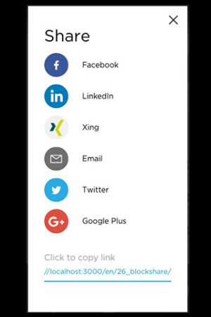
Block: Share

Block: Table


Fields
- Table Background Color (Select) Select a background color for the first table columnOptions:
- Orange
- Blue
- Hide Table Header (True_false)
- Thin forms? (True_false) Show a thin form for forms with more data.
- Table (Post_object) Please select a table from the dropdown. Tables are created in the JTRT Tables plugin.
- Component Title (Text) Title shown in navigation and in the backend, doesn't show on the frontend (other than in the Sub Navigation)
- Component Anchor (Text) Use this anchor to link directly to this section. E.g. enter
'gallery'to be able to link tohttps://ihredomain.com/page#gallery. Do NOT enter the '#' symbol. - Hide Component (True_false) Hide the component, when this option is active
- Show Line Decoration (Button_group) Show/hide the connecting line at the bottom/top/both of the component.Options:
- None
- Top
- Bottom
- Both
Block: Text Image (2 cols)

Fields
- Slides (Repeater)
- Video Link (if there is one) (Url)
- Image (Image) No fixed image height is required, component can support different image aspect ratios. Recommended minimum image width: 1024px.
Sample size / e.g.: 1200x675 - Content (Wysiwyg)
- Background Color (Select)Options:
- White
- Light Blue
- Blue
- Component Title (Text) Title shown in navigation and in the backend, doesn't show on the frontend (other than in the Sub Navigation)
- Component Anchor (Text) Use this anchor to link directly to this section. E.g. enter
'gallery'to be able to link tohttps://ihredomain.com/page#gallery. Do NOT enter the '#' symbol. - Hide Component (True_false) Hide the component, when this option is active
- Show Line Decoration (Button_group) Show/hide the connecting line at the bottom/top/both of the component.Options:
- None
- Top
- Bottom
- Both
Block: Block Text Image Crop

Fields
- Image Position (Button_group)Options:
- Video Link (if there is one) (Url)
- Image (Image) The image is sized according to the text height and gets cropped when resized. Recommended minimum image width: 1024px.
- Content (Wysiwyg)
- Background Color (Select)Options:
- White
- Light Blue
- Blue
- Component Title (Text) Title shown in navigation and in the backend, doesn't show on the frontend (other than in the Sub Navigation)
- Component Anchor (Text) Use this anchor to link directly to this section. E.g. enter
'gallery'to be able to link tohttps://ihredomain.com/page#gallery. Do NOT enter the '#' symbol. - Hide Component (True_false) Hide the component, when this option is active
- Show Line Decoration (Button_group) Show/hide the connecting line at the bottom/top/both of the component.Options:
- None
- Top
- Bottom
- Both
Block: Unibuddy - Landing Page
Fields
- Iframe Url (Url)
Block: Unibuddy - Slider
Fields
- University Slug (Select)Options:
- Students
- Admitted Candidates
Block: Video Text


Fields
- Optional Overlay (True_false) Choose to show a black gradient over the image.
- Desktop Poster Image (Image_crop) Poster image that shows before the video is played. Recommended resolution greater than 1200 x 675px.
- Mobile Poster Image (Image_crop) Recommended resolution greater than 380 x 570px.
- Video (Oembed) Video link, just post the full url to the Vimeo or YouTube video here. Correct videos will show a preview bellow.
- Content (Wysiwyg) Content that sits over the preview image, free content. Recommended Characters: Heading: 10-20, Content: 80-120
- Component Title (Text) Title shown in navigation and in the backend, doesn't show on the frontend (other than in the Sub Navigation)
- Component Anchor (Text) Use this anchor to link directly to this section. E.g. enter
'gallery'to be able to link tohttps://ihredomain.com/page#gallery. Do NOT enter the '#' symbol. - Hide Component (True_false) Hide the component, when this option is active
- Show Line Decoration (Button_group) Show/hide the connecting line at the bottom/top/both of the component.Options:
- None
- Top
- Bottom
- Both
Block: Wysiwyg

Fields
- Content (Wysiwyg) Free content area, no size restrictions.
- Component Title (Text) Title shown in navigation and in the backend, doesn't show on the frontend (other than in the Sub Navigation)
- Component Anchor (Text) Use this anchor to link directly to this section. E.g. enter
'gallery'to be able to link tohttps://ihredomain.com/page#gallery. Do NOT enter the '#' symbol. - Hide Component (True_false) Hide the component, when this option is active
- Show Line Decoration (Button_group) Show/hide the connecting line at the bottom/top/both of the component.Options:
- None
- Top
- Bottom
- Both
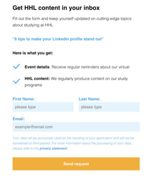
Form: Leads

Fields
- Content (Wysiwyg) Content that sits on the left of the form.
- Image (Image)
- Form (Select) Select the form that you wish to showOptions:
- Event Registration
- Brochure Download
- Contact Wish
- CV Check
- Gated Content
- Employment Report
- Formular Newsletter
- Accept Privacy Content (Text) Leave it blank if you want to use the default content.
- Show Stay Up To Date section (True_false)
- Stay Up To Date Content (Text) Leave it blank if you want to use the default content.
- Submit Button Title (Text) Leave it blank if you want to use the default content.
- Campaign Name (Text)
- Campaign ID (Text)
- Success Page Link Type (Button_group)Options:
- Internal
- Custom Link
- Link (Page_link) Success page link (internal)
- Link (Url) Success page link (external)
- Form Endpoint with SOI (Url) This should either be Salesforce or Pardot endpoint url, if user opted-in.
- Form Endpoint without SOI (Url) This should either be Salesforce or Pardot endpoint url, if user opted-out.
- Component Title (Text) Title shown in navigation and in the backend, doesn't show on the frontend (other than in the Sub Navigation)
- Component Anchor (Text) Use this anchor to link directly to this section. E.g. enter
'gallery'to be able to link tohttps://ihredomain.com/page#gallery. Do NOT enter the '#' symbol. - Hide Component (True_false) Hide the component, when this option is active
- Show Line Decoration (Button_group) Show/hide the connecting line at the bottom/top/both of the component.Options:
- None
- Top
- Bottom
- Both
Grid: Contacts


Fields
- Title (Wysiwyg) Headline title for the component. Recommended Characters: 20-80
- Hide Contact Details (True_false) Hide the contacts contact datails (phone/email etc)
- Contacts (Repeater) Repeater that allows for the selection of people created under the people tab.
- Contact (Post_object)
- Show Profile? (Button_group)Options:
- None
- Link
- Popup CV
- Custom CTA Button
- CV Link (Url)
- Open in new Window? (True_false)
- CTA (Link)
- Component Title (Text) Title shown in navigation and in the backend, doesn't show on the frontend (other than in the Sub Navigation)
- Component Anchor (Text) Use this anchor to link directly to this section. E.g. enter
'gallery'to be able to link tohttps://ihredomain.com/page#gallery. Do NOT enter the '#' symbol. - Hide Component (True_false) Hide the component, when this option is active
- Show Line Decoration (Button_group) Show/hide the connecting line at the bottom/top/both of the component.Options:
- None
- Top
- Bottom
- Both
Grid: Content


Fields
- Pre Content (Wysiwyg) Content that shows above the grid of content, this content will be centered. No restrictions.
- Content Type (Button_group) Select the type of content that you want to show.Options:
- Events
- Posts
- Pages
- Upcoming Events
- Show CTA (True_false) Show/Hide CTA for each post
- Slider ? (True_false) If there are more than 3 posts and this is set to true, the module will turn to a slider
- Selection (Button_group)Options:
- Latest
- Manual
- Category
- Admin Category
- Post Tags (Taxonomy) Leave empty to show all posts
- Event Tags (Taxonomy) Leave empty to show all events
- Number of posts (Number) Set -1 to get all posts
- Content (Relationship)
- Category (Taxonomy)
- Admin Category (Taxonomy)
- Link (Link) Link at bottom of component
- Component Title (Text) Title shown in navigation and in the backend, doesn't show on the frontend (other than in the Sub Navigation)
- Component Anchor (Text) Use this anchor to link directly to this section. E.g. enter
'gallery'to be able to link tohttps://ihredomain.com/page#gallery. Do NOT enter the '#' symbol. - Hide Component (True_false) Hide the component, when this option is active
- Show Search Box? (True_false)
- Show Line Decoration (Button_group) Show/hide the connecting line at the bottom/top/both of the component.Options:
- None
- Top
- Bottom
- Both
Grid: Logos


Fields
- Pre Logo Content (Wysiwyg) Content that sits above the grid of Logos. No restrictions.
- Logos (Repeater)
- Logo (Image) Recommended minimum image size: 400px x 150px.
- Link (Url)
- title (Text)
- Component Title (Text) Title shown in navigation and in the backend, doesn't show on the frontend (other than in the Sub Navigation)
- Component Anchor (Text) Use this anchor to link directly to this section. E.g. enter
'gallery'to be able to link tohttps://ihredomain.com/page#gallery. Do NOT enter the '#' symbol. - Columns (Select)Options:
- 1 Column
- 2 Columns
- 3 Columns
- Hide Component (True_false) Hide the component, when this option is active
- Show Line Decoration (Button_group) Show/hide the connecting line at the bottom/top/both of the component.Options:
- None
- Top
- Bottom
- Both
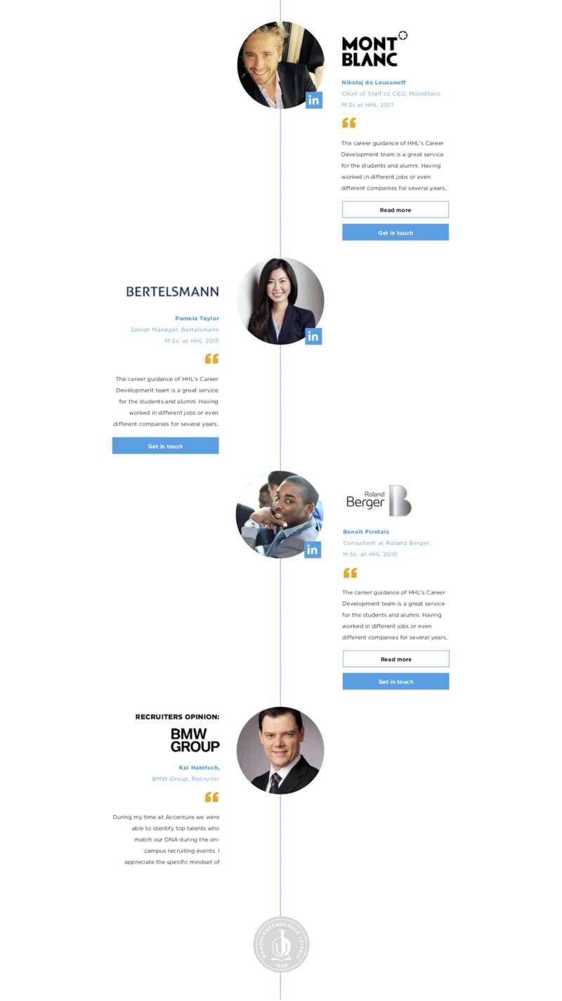
Grid: Quotes


Fields
- Quote Pre Content (Wysiwyg) Content that sits above the quotes. No content restrictions.
- Quotes (Repeater) A repeater of Quotes.
- Quote (Wysiwyg) The quote, there are no content restrictions here. Automatically shows 'read more' button after 4 lines.
- Image (Image) Square image for quote, recommended minimum size 320px x 320px.
- Name (Text) Name of quote source. Recommended Characters: 20-80
- Job Title (Text) Job Title of quote source. Recommended Characters: 20-120
- Custom Logo Image (Image) Leave this empty to use the LinkedIn logo.
- Logo Link (Url) Optional link for the logo/profile photo.
- Call To Action Links (Repeater)
- Component Title (Text) Title shown in navigation and in the backend, doesn't show on the frontend (other than in the Sub Navigation)
- Component Anchor (Text) Use this anchor to link directly to this section. E.g. enter
'gallery'to be able to link tohttps://ihredomain.com/page#gallery. Do NOT enter the '#' symbol. - Autoplay ? (True_false)
- Autoplay Interval (in ms) (Number)
- Hide Component (True_false) Hide the component, when this option is active
- Show Line Decoration (Button_group) Show/hide the connecting line at the bottom/top/both of the component.Options:
- None
- Top
- Bottom
- Both
- Disable Quotation Marks (True_false)

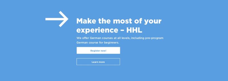
Hero: BlockArrowCTA

Fields
- Color Scheme (Select) Choose the background colour.Options:
- blue
- gray
- orange
- white
- content (Wysiwyg) The content of the CTA, no specific restrictions, but looks best with a h1/h2 with 30-100 characters before the main copy.
- Cta (Repeater)
- Call to Action (Link)
- Cta Style (Select) The style of the button, primary (blue background) or secondary (blue border)Options:
- Secondary
- Primary
- Component Title (Text) Title shown in navigation and in the backend, doesn't show on the frontend (other than in the Sub Navigation)
- Component Anchor (Text) Use this anchor to link directly to this section. E.g. enter
'gallery'to be able to link tohttps://ihredomain.com/page#gallery. Do NOT enter the '#' symbol. - Hide Component (True_false) Hide the component, when this option is active
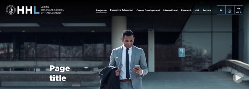
Hero: HeaderMedia

Fields
- Content (Wysiwyg)
- Media Type (Button_group) Choose if the header is a video or a image component.Options:
- Image
- Video
- Image (Image_crop) Recommended resolution greater than 2000 x 720 px, this image will be the poster image if a video is set.
- Mobile Image (Image_crop) Recommended resolution greater than 380 x 570px.
- Video (Oembed)
- Component Title (Text) Title shown in navigation and in the backend, doesn't show on the frontend (other than in the Sub Navigation)
- Component Anchor (Text) Use this anchor to link directly to this section. E.g. enter
'gallery'to be able to link tohttps://ihredomain.com/page#gallery. Do NOT enter the '#' symbol. - Hide Component (True_false) Hide the component, when this option is active
- Add overlay (True_false)
- Show Line Decoration (Button_group) Show/hide the connecting line at the bottom/top/both of the component.Options:
- None
- Top
- Bottom
- Both
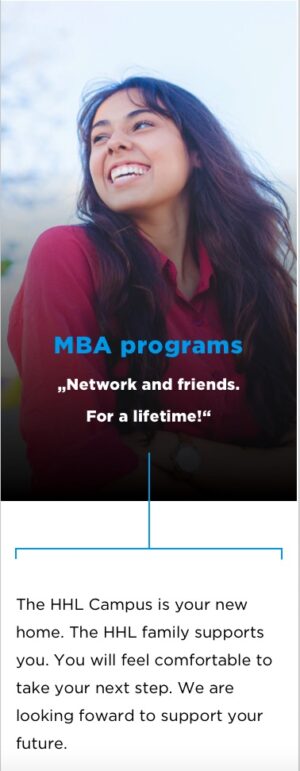
Hero: ImageText


Fields
- Optional Overlay (True_false) Choose to show a black gradient over the image.
- Desktop Image (Image_crop) Recommended resolution greater than 2000 x 720 px.
- Mobile Image (Image_crop) Recommended resolution greater than 380 x 570 px.
- Content (Wysiwyg) The content that sits over the image. Character Recommendations: Title : 30-100, Content: 80-250.
- Component Title (Text) Title shown in navigation and in the backend, doesn't show on the frontend (other than in the Sub Navigation)
- Component Anchor (Text) Use this anchor to link directly to this section. E.g. enter
'gallery'to be able to link tohttps://ihredomain.com/page#gallery. Do NOT enter the '#' symbol. - Hide Component (True_false) Hide the component, when this option is active
- Show Line Decoration (Button_group) Show/hide the connecting line at the bottom/top/both of the component.Options:
- None
- Top
- Bottom
- Both
Hero: MediaSlider


Fields
- Slides (Repeater) Repeater of slides.
- Content (Tab)
- Media Type (Button_group) Choose between video and image. If video is chosen a poster image is still required.Options:
- Image
- Video
- Content (Wysiwyg) Content that sit above the image/video. Character Recommendations: Title: 50-70, Content: 100-200
- Image (Image_crop) Recommended resolution greater than 2000 x 1160 px, this image will be the poster image if a video is set.
- Mobile Image (Image_crop) Recommended resolution greater than 380 x 570px.
- Video (Oembed) Video link, just post the full url to the Vimeo or YouTube video here. Correct videos will show a preview bellow.
- Settings (Tab)
- Add overlay (True_false) Add a gradient overlay to the slide, for lighter slides
- Component Title (Text) Title shown in navigation and in the backend, doesn't show on the frontend (other than in the Sub Navigation)
- Component Anchor (Text) Use this anchor to link directly to this section. E.g. enter
'gallery'to be able to link tohttps://ihredomain.com/page#gallery. Do NOT enter the '#' symbol. - Auto Slide (True_false) Allow the hero slider to auto slide.
- Auto Slide Speed (Number)
- Hide Component (True_false) Hide the component, when this option is active
- Show Line Decoration (Button_group) Show/hide the connecting line at the bottom/top/both of the component.Options:
- None
- Top
- Bottom
- Both

List: Components
Fields
- Pre Content (Wysiwyg)
List: Facts
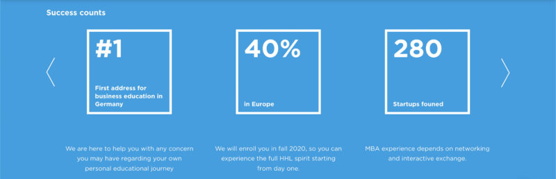
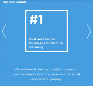
Fields
- Title (Text)
- Facts (Repeater)
- Number (Text)
- Number label (Text)
- Title (Text)
- Content (Text)
- Component Title (Text) Title shown in navigation and in the backend, doesn't show on the frontend (other than in the Sub Navigation)
- Component Anchor (Text) Use this anchor to link directly to this section. E.g. enter
'gallery'to be able to link tohttps://ihredomain.com/page#gallery. Do NOT enter the '#' symbol. - Hide Component (True_false) Hide the component, when this option is active
- Background Color (Select)Options:
- Dark Blue
- White
- Blue
List: Quote

Fields
- Quotes (Repeater) A repeater of the quote blocks.
- Quote Alignment (Select) Choose the side that the quote sits on.Options:
- Left
- Right
- Quote Byline (Text) The quote Byline, sites above the logo if chosen.
- Show Brand Logo (True_false) Choose to show either the brand logo, or the brand name as a text field
- Brand Image (Image) Recommended Resolution: 380px x 150px
- Brand Title (Text) The brand title, shown if the image is not.
- Person Image (Image) Square image for quote, recommended minimum size 320px x 320px
- Person Name (Text) Name of quote source. Recommended Characters: 20-80
- job Title (Text) Job Title of quote source. Recommended Characters: 20-120
- Degree (Text) A post fix for the Job title, normally the degree level in the designs (optional). Recommended Characters: 20-120
- Quote (Wysiwyg) The quote, there are no content restrictions here, but use [readmore][/readmore] to allow for longer quotes.
- Custom Logo Image (Image) Leave this empty to use the LinkedIn logo.
- Logo Link (Url) The optional link that the logo and profile image will link to.
- Call to Action Links (Repeater)
- Quote Alignment (Select) Choose the side that the quote sits on.
- End Logo (Image) Recommended image size is 402px x 402px
- Component Title (Text) Title shown in navigation and in the backend, doesn't show on the frontend (other than in the Sub Navigation)
- Component Anchor (Text) Use this anchor to link directly to this section. E.g. enter
'gallery'to be able to link tohttps://ihredomain.com/page#gallery. Do NOT enter the '#' symbol. - Hide Component (True_false) Hide the component, when this option is active
- Show Line Decoration (Button_group) Show/hide the connecting line at the bottom/top/both of the component.Options:
- None
- Top
- Bottom
- Both
Navigation: Sub


Fields
- Type (Button_group) 'Anchors' uses the component anchors and corresponding order from the components on the current page.Options:
- Anchors
- Custom
- Navigation Items (Repeater)
- Type (Button_group)Options:
- Anchor
- Internal Link
- Custom Link
- Link Text (Text)
- Link (Url)
- Link (Page_link)
- Anchor (Text)
- Type (Button_group)
- Component Title (Text) Title shown in navigation and in the backend, doesn't show on the frontend (other than in the Sub Navigation)
- Component Anchor (Text) Use this anchor to link directly to this section. E.g. enter
'gallery'to be able to link tohttps://ihredomain.com/page#gallery. Do NOT enter the '#' symbol. - Show all items (disable 'expand' button) (True_false) Choose to show the menu fully expanded at all times.
- Hide Component (True_false) Hide the component, when this option is active
- Show Line Decoration (Button_group) Show/hide the connecting line at the bottom/top/both of the component.Options:
- None
- Top
- Bottom
- Both
Reusable
Fields
- Select Reusable Components (Post_object)
Slider: Gallery


Fields
- Pre Content (Wysiwyg) The content that sits above the slider. No content restrictions
- Gallery slide (Repeater) A repeater of image of videos
- Media Type (Button_group) Choose between video and image.Options:
- Image
- Video
- Enable Popup (True_false) Enable the lightbox popup
- Image (Image_crop) Recommended resolution greater than 380px x 380 px, this image will be the poster image if a video is set.
- Video (Oembed)
- Media Type (Button_group) Choose between video and image.
- Call To Action (Link)
- Hide Component (True_false) Hide the component, when this option is active
- Autoplay ? (True_false)
- Autoplay Interval (in ms) (Number)
- Pictures by slide (Select)Options:
- Array
- Show Line Decoration (Button_group) Show/hide the connecting line at the bottom/top/both of the component.Options:
- None
- Top
- Bottom
- Both
Form: Contact

Fields
- Form Content (Wysiwyg)
- Contact Form 7 Form (Post_object) If there is no form available, please first create a suitable one in the Contact Form 7 admin page.
- Component Title (Text) Title shown in navigation and in the backend, doesn't show on the frontend (other than in the Sub Navigation)
- Component Anchor (Text) Use this anchor to link directly to this section. E.g. enter
'gallery'to be able to link tohttps://ihredomain.com/page#gallery. Do NOT enter the '#' symbol. - Hide Component (True_false) Hide the component, when this option is active
- Decoration Top (Select) The decoration shown at the top of the component, 'border' will show the containing bracket. 'line' just the vertical lineOptions:
- None
- Line
- Border
- Decoration Bottom (Select) The decoration shown at the bottom of the component, 'border' will show the containing bracket. 'line' just the vertical lineOptions:
- None
- Line